At first glance, it sounds like the kind of detail most people would miss on a busy street.
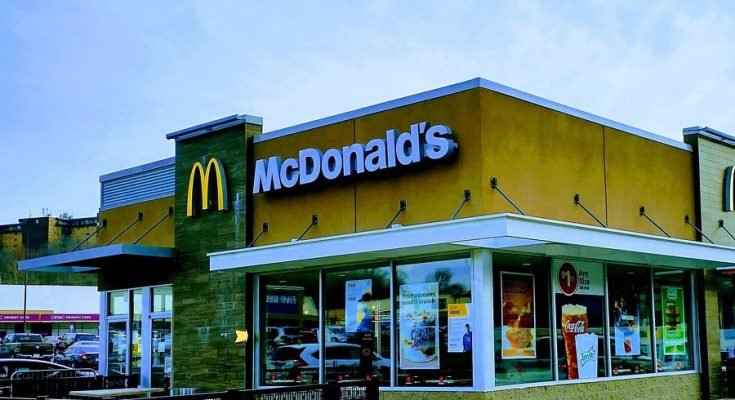
A customer walks toward a McDonald’s, slows down, and then looks again. The sign is familiar. The lighting is familiar. The menu inside is exactly what they expect. But something about the entrance feels wrong.
Then it clicks: the door is gone.
That absence is what makes the idea so memorable. In a world where brands usually compete by adding more noise, more slogans, and more visual clutter, the stronger move can sometimes be to remove something ordinary and let people notice what is no longer there. That is the logic behind a reported McDonald’s concept tied to select 24-hour locations, where the missing door becomes the message itself.
A Simple Change That Says More Than a Slogan
Most advertising tries very hard to explain itself. It tells people what to feel, what to remember, and what to do next. This concept works differently. It does not begin with a long statement. It begins with a visual interruption.
A door is one of the most basic symbols in public life. It opens, it closes, it separates inside from outside. It marks access, but it also marks limits. Even when a store is technically open, a closed-looking entrance can still suggest distance.
Take that away, and the meaning changes immediately.
For a restaurant built around convenience, speed, and routine, the missing door becomes a sharp visual way of saying something customers already understand: this place is meant to feel available at all hours. Instead of repeating “open late” or “open 24/7” in the usual format, the building itself delivers the line.
That is what makes the concept clever. It turns architecture into communication.
The Power of Letting People Discover the Point
One reason minimalist campaigns travel so well is that they leave room for discovery. People are more likely to remember something when they feel they figured it out for themselves.
That is exactly what happens with an idea like this. A person sees the entrance, notices the missing element, pauses, and starts connecting the dots. The restaurant does not have to shout. The design creates the reaction on its own.
That small moment matters more than it might seem.
Modern audiences are surrounded by constant prompts for attention. They scroll past graphics, autoplay clips, pop-ups, and promotional messages every day. Most of it is forgotten almost instantly. But a physical environment that feels slightly off can stop people in a way a banner never will.
A missing door is not just an object removed. It is a question placed in public.
Why is it gone? What is the point? Is this permanent? Is it a stunt?
The moment those questions begin, the campaign is already working.
When Everyday Objects Become Brand Language
The strongest campaigns often do not rely on inventing something completely new. They look at familiar objects and reframe them.
That appears to be the case here. The door, normally a practical feature, takes on a second life as a symbol. Reports around the concept suggest the removed doors may even be reused as installations outside the location, paired with messaging that reinforces the same idea: if the restaurant never closes, why should the door remain a symbol of closing?
It is a playful shift, but also a strategic one.
Brands spend enormous amounts of money trying to create recognizable assets. Sometimes those assets are colors, mascots, packaging, or jingles. In this case, the object is not something added to the brand universe. It is something taken out of the setting and turned into a talking point.
That kind of restraint can feel more confident than a louder campaign. It suggests the brand trusts the audience to get the joke, understand the signal, and carry the message further.
Why This Kind of Marketing Travels So Fast
Ideas like this are built for the way people behave now.
Someone notices the entrance. Someone else photographs it. Another person posts it with a short caption. Within hours, the image has become bigger than the street where it was first seen. A simple design gesture starts circulating as a shareable visual.
That does not happen by accident.
The most effective public campaigns tend to have three things in common: they are easy to understand, visually distinct, and flexible enough to work online as well as offline. A restaurant without doors checks all three boxes. It looks unusual immediately. The concept is understandable within seconds. And it gives people something worth posting because it feels slightly surreal in an otherwise ordinary setting.
That is where the real value emerges.
The installation itself may be local, but the conversation it generates can become much wider. A customer with a phone is no longer just a passerby. They become part of the distribution system. The campaign spreads not because the brand forces it into every feed, but because people find it naturally strange enough to share.
More Than a Stunt, If It Leads Somewhere
Creative concepts are easier to admire than to use. Many brand stunts attract attention without offering much practical value. What separates a strong campaign from a forgettable one is whether curiosity leads to something useful.
That is why the reported digital layer matters. If repurposed door displays include QR codes directing people to nearby open locations, the idea moves beyond symbolism. It becomes functional.
That small detail changes the experience.
A person sees something unusual in public. They interact with it. Within seconds, they are not just thinking about the brand. They are being guided toward a real purchase decision. The path from awareness to action becomes shorter and smoother.
This is where many modern campaigns are heading. The best physical activations no longer live in isolation. They are designed to connect instantly with the phone in someone’s hand. A street-level surprise becomes a digital entry point. A creative concept becomes a navigation tool.
The result feels less like advertising in the traditional sense and more like a branded experience with a purpose.
What It Says About McDonald’s as a Brand
McDonald’s has always been strongest when it presents itself not as a luxury or a rare occasion, but as a familiar part of daily life. Morning coffee, late-night fries, a quick meal between errands, a stop during travel. Its brand power comes from routine, visibility, and the promise of convenience.
That is why this concept fits so naturally with the company’s identity.
It does not try to turn the brand into something mysterious or overly polished. Instead, it leans into a message McDonald’s has spent years building: accessibility. The missing door becomes a visual shorthand for that promise. No barrier. No shutdown feeling. No symbolic end to service.
Even if the campaign is lighthearted, the strategic point is serious. It reinforces what the brand wants people to believe about it in the most immediate way possible.
Not through a claim.
Through a physical cue.
A Quiet Lesson in Modern Advertising
There is a useful lesson in this concept, whether it expands further or remains a limited creative experiment.
Brands do not always need to say more. Sometimes they need to stage one sharp idea and then step back.
The reason this campaign stands out is not because it is complicated. It stands out because it is unusually clear. Remove a familiar object. Let people notice the difference. Attach that difference to a message the brand already owns. Then allow the public to do the rest.
That is far harder to achieve than it sounds.
Simplicity only works when the idea underneath it is strong. In this case, the missing door does more than decorate a restaurant. It reframes how the location communicates openness, availability, and identity.
And in a crowded advertising landscape, that may be the boldest move of all: not adding another message, but removing the barrier and letting the absence speak for itself.