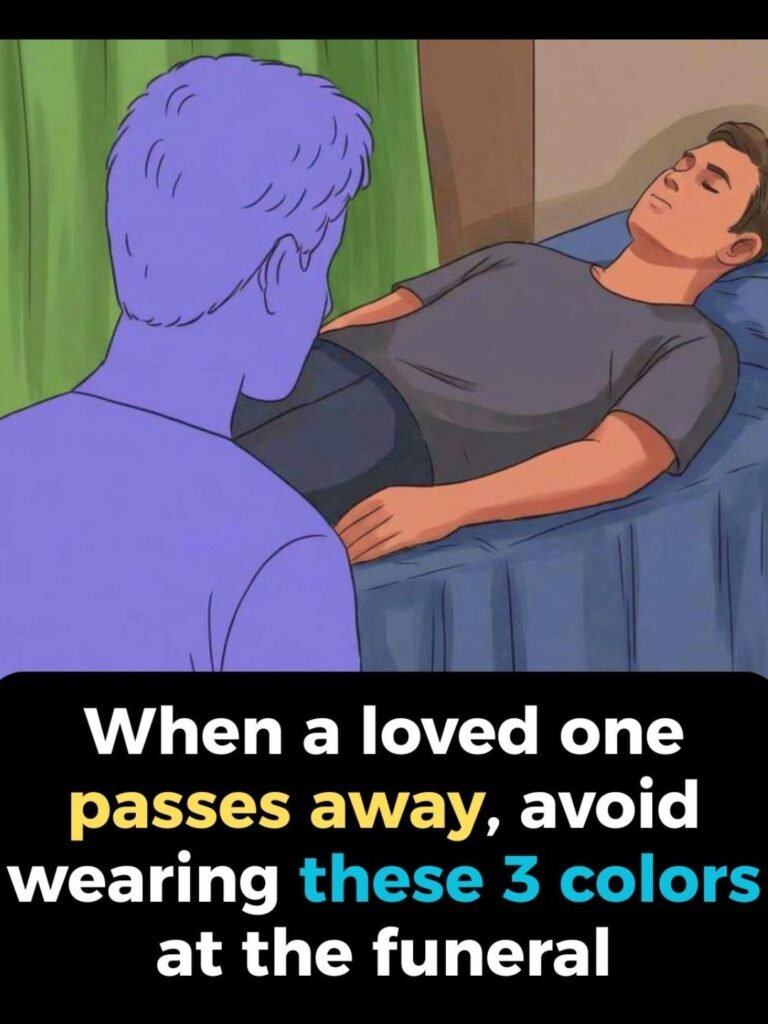
Standing in front of a closet before a funeral feels different.
Clothes that normally express personality suddenly feel inappropriate. Bright colors seem too loud. Casual outfits feel careless. Even familiar pieces take on new weight.
What you wear in that moment isn’t about fashion.
It’s about respect.
And color plays a larger role than most people realize.
Why Black Became the Default
Black didn’t become the “mourning color” by accident.
Historically, it symbolized:
- Sobriety
- Seriousness
- Withdrawal from celebration
- Social restraint
In many Western cultures, black communicated that someone was stepping away from ordinary life to acknowledge loss.
Over time, it became tradition.
Not law — but expectation.
Colors That Often Feel Out of Place
While customs vary, some colors consistently feel inappropriate in formal mourning settings.
Bright Red
Red represents energy, passion, and vitality.
At a funeral, it can feel jarring — even if unintentionally.
It draws attention when attention should be minimized.
Neon and Fluorescent Shades
Highly saturated colors signal celebration.
They clash with solemn atmospheres and can appear dismissive of grief.
Pure White (In Some Cultures)
In Western settings, white can appear too bridal or ceremonial.
However, in parts of Asia, white is the traditional mourning color.
Context matters.
Loud Patterns and Graphics
It’s not just color.
Large logos, slogans, and bold prints shift focus away from the purpose of gathering.
Subtlety matters more than style.
Cultural Differences in Mourning Colors
Not all societies associate mourning with black.
Examples:
- East Asia: White
- Parts of Africa: Red or brown
- Some Indigenous cultures: Symbolic patterns
- Latin cultures: Black with regional variations
Understanding local customs shows respect.
When unsure, neutral tones are safest.
Why Muted Colors Are Usually Preferred
Muted tones communicate restraint.
Examples include:
- Dark navy
- Charcoal gray
- Deep brown
- Soft beige
- Muted blue
These colors honor the mood without appearing severe.
They balance dignity and comfort.
The Role of Fabric and Fit
Color isn’t everything.
Wrinkled, revealing, or overly casual clothing can feel disrespectful regardless of shade.
Fit and condition communicate intention.
Simple, neat clothing speaks louder than expensive labels.
When Bright Colors Are Requested
Some families request celebratory attire.
They may ask attendees to wear bright colors to honor life rather than mourn loss.
In these cases, tradition shifts.
Respect means following the family’s wishes.
Why People Feel Self-Conscious at Funerals
Funerals heighten social awareness.
Everyone worries about doing the wrong thing.
Clothing becomes symbolic.
It’s a visible way to show care when words feel inadequate.
The Psychology of “Blending In”
Most people instinctively choose outfits that won’t stand out.
Blending in signals solidarity.
It says: “I’m here to support, not to be noticed.”
That unspoken message matters.
Why “There Are No Rules” Isn’t Entirely True
Technically, there are no legal dress codes.
But social norms still exist.
Ignoring them doesn’t show individuality — it shows disconnection.
Context gives meaning to choices.
Practical Guidelines When Unsure
If you’re uncertain, aim for:
- Dark or neutral colors
- Minimal patterns
- Modest fit
- Clean, pressed clothing
This combination is rarely inappropriate.
What Matters More Than Color
Presence matters more than appearance.
Kindness matters more than coordination.
But thoughtful clothing shows that you took the moment seriously.
That effort is noticed.
The Calm Takeaway
Funeral attire isn’t about following rigid rules.
It’s about aligning with the emotional tone of the moment.
Avoiding loud colors isn’t about restriction.
It’s about respect.
In times of loss, quiet choices speak the clearest.